Northern Westchester Hospital - Logo and Brand Identity Design
Ranked #1 in New York State for patient satisfaction Northern Westchester Hospital (NWH) knows a great deal about patient care. They are dedicated to treating their patients as people first and foremost and needed an updated brand identity to reflect their passion for, and commitment to patient centered care.
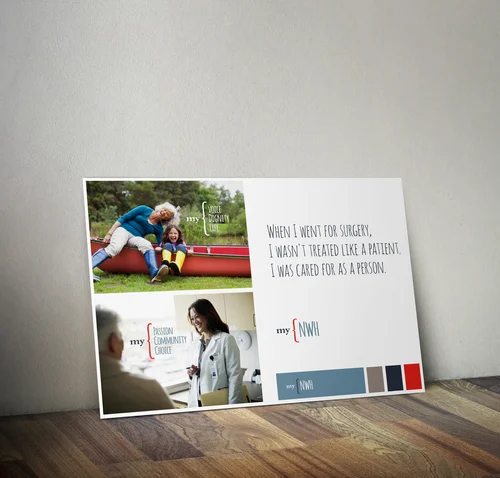
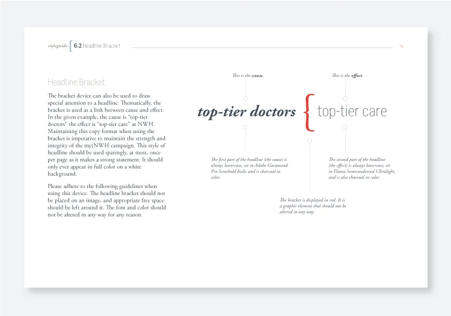
To help introduce the new NWH brand, a campaign was developed to showcase the sense of ownership and pride employees and patients feel toward the hospital. The campaign mark, bracket graphic, and supporting imagery were developed to tell the NWH story from the perspective of doctors, staff and patients at the hospital.
Deliverables
- Brand personas
- Campaign mark
- Logo redesign
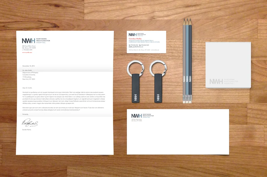
- Brand identity design
- Brand guidelines
- Print advertisement templates
Brand Personas
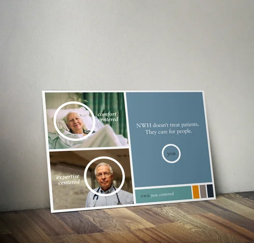
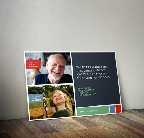
Brand personas - initial concepts for the NWH campaign and brand identity design showing copy tone, imagery and colour.
You centered concept, using a bold graphic element to place the patient at the centre of care.
A bolder more editorial style direction using subtle arc in shapes as a reference to the gentle curves in the newly designed hospital wing.
Campaign Mark
Logo Redesign
With the myNWH campaign design complete the logo re-design followed. Elements of the myNWH campaign were leveraged in the new brand design to maintain consistency across the brand identity system. The campaign mark and the new logo needed to be complementary but also distinct from one another. They needed to be a system but also able to stand on their own. We accomplished consistency through color. Then by using a typographic approach (without additional illustration or graphics) we created a distinct, fresh and modern new logo design.
The new brand identity system is a bold new look for a hospital that is taking an innovative and often courageous approach to patient care.
Brand Colors
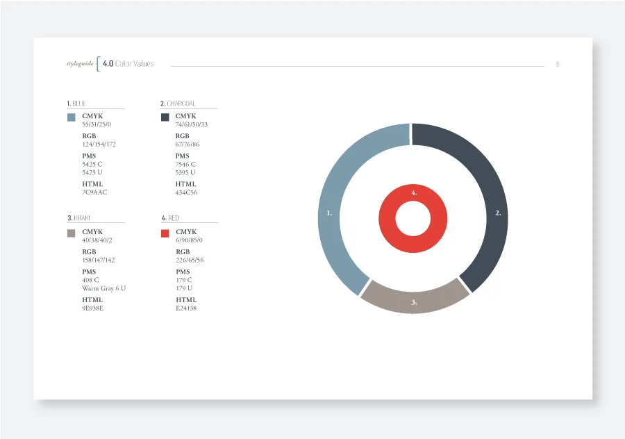
A mix of traditional and bold brand colors were chosen to speak to both experience and passion. Dark and neutral colors were chosen to ground and also compliment the vibrant red. Red was chosen because of its boldness. NWH stands apart from their competition in many ways, so a bright red gives them a way to highlight their differences, it is a way to visually express the passion they have for the important work they do each day.
