BMO - Wealth Management Tool, UX Strategy & Research
Context
Having seen similar tools pop up in the marketplace from their competitors, BMO came to Usability Matters with the request to design a tool to provide education on investment options to current and perspective BMO wealth management clients.
Challenge
We received the following design criteria from the BMO team:
- Design process must use a lean methodology for speed to market
- Tool must be intuitive and friendly to use
- Designed for scalability
- Must be responsive
However from my perspective the biggest challenge for this project had more to do with internal politics and scoping than with specific design requirements.
1. Too many cooks in the kitchen
We were tasked with working with a large team of stakeholders (10 - 15 people depending on the day) with little clarification about who officially owned the project and would be responsible for final sign off.
2. Product vs. user
Although the goal of the tool was initially described as being educational in nature, informing users of the financial opportunities available to them and helping users find the best service or product to meet their needs. It quickly became apparent that the real business driver was increasing sales of their investment products and/or services (which is understandable from a purely business perspective) but difficult when trying to design using a user centered approach.
3. Designing without the user
Lastly, we were only given access to internal stakeholders and wealth management advisors. Primary user research was not in scope and unfortunately neither was user testing, meaning we would have to base our design decisions solely on secondary research (a fact that made our whole team feel uneasy) but did lead to some creative workarounds as we attempted to build personas and journey maps based on the research we did have access to.
Process
Given our timeframe of 6 weeks, we proposed a ten day strategy phase that would serve as the foundation for the design of the tool, and would also hopefully bring alignment to our large team of stakeholders. I was responsible for this initial phase of the project while my colleague took the lead on design.
The strategy phase included the following activities:
- Requirements gathering workshop with primary stakeholders
- Advisor interviews
- Competitive review
- User proto personas (based on secondary research)
- Customer journey maps
Requirements Gathering Workshop
After our initial kick off meeting (with the usual meet and greet, timeline review and Q&A session) we moved onto the requirements gathering workshop. With 3 of us and 12 BMO stakeholders we knew we would have to use our time efficiently, so we focused on 2 activities for the afternoon, a requirements gathering collaborative session and our tried and true love letter from the future.
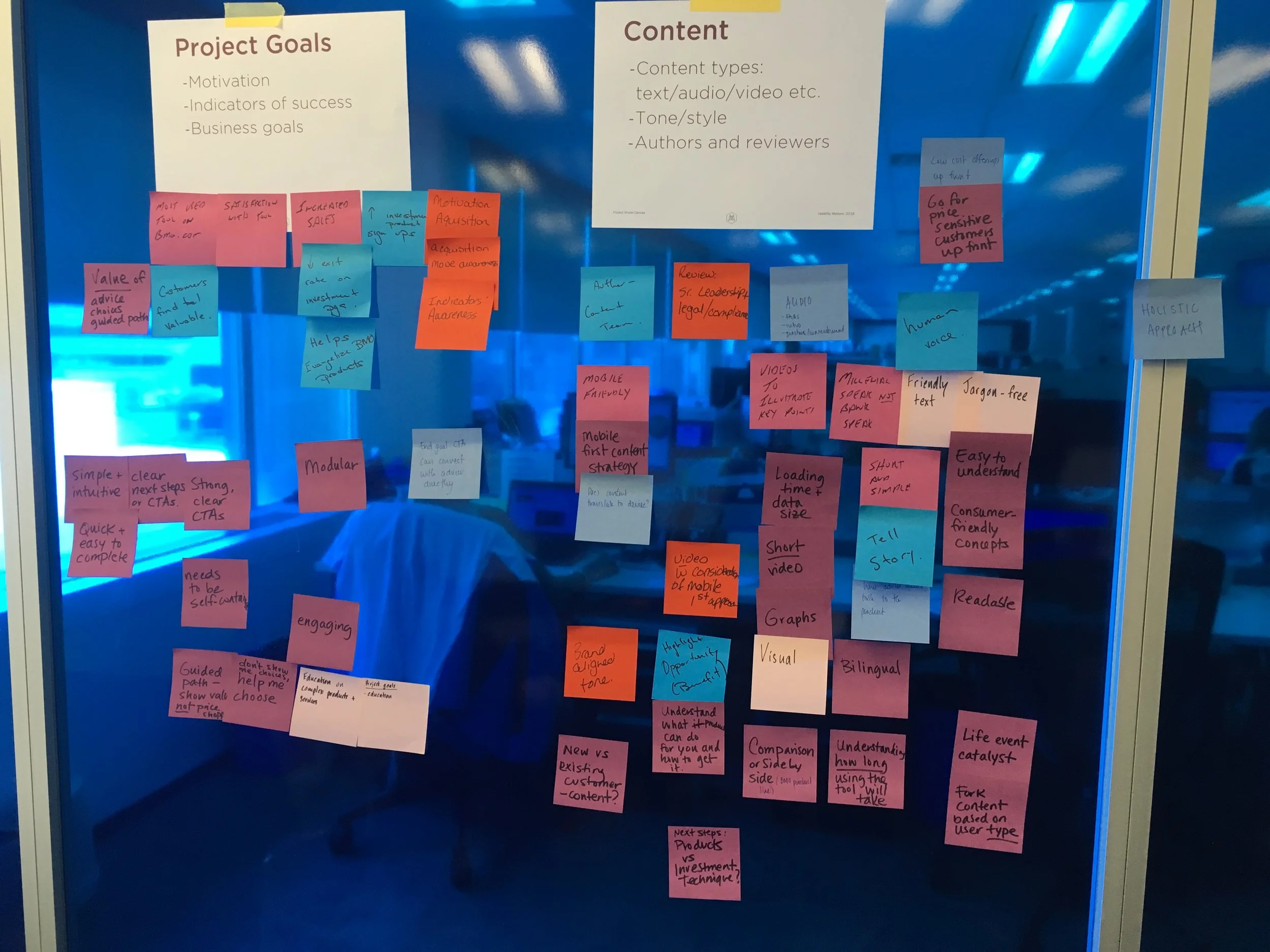
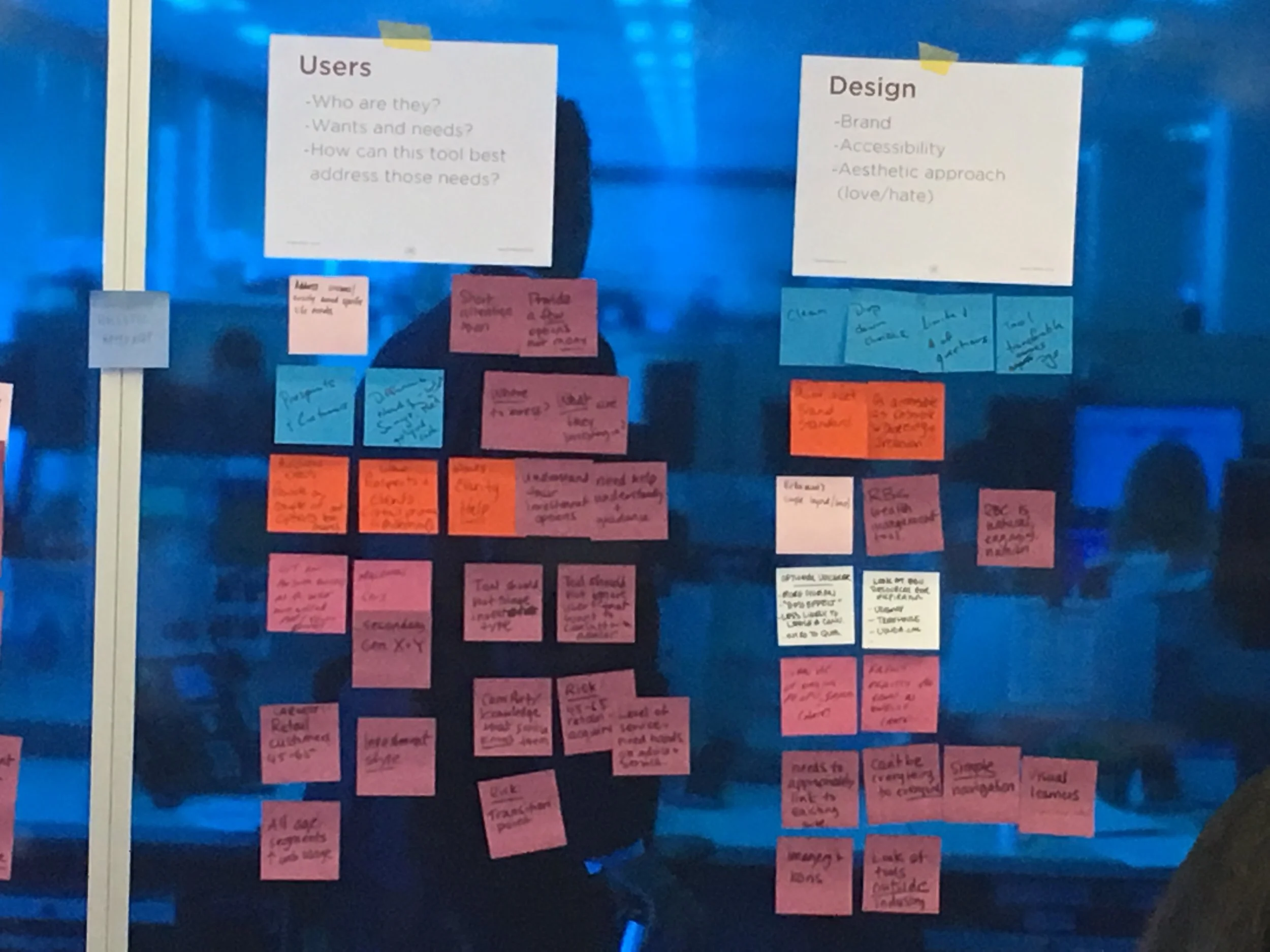
Using the project model canvas template for structure we focused on collecting requirements on 7 key areas (business goals, project goals, users, content, systems, design, and risk) in a collaborative session with the BMO stakeholder team.
We used a summary of the results (presented below) along with advisor interviews and additional research provided by BMO to produce a series of proto personas and journey maps to inform the design of the tool.
- Business goals: increase investment product sign ups and decrease bounce rates from investment pages.
- Project goals:
- Increase current and perspective user awareness about BMO wealth management products and service offerings.
- Educate and guide users to financial options that are of value to them, don't just present a shopping list of products.
- Create meaningful content that is easy to access and is relevant to the user’s financial situation and stage of life.
- Need clearly defined CTAs so users understand the next steps and all the choices available to them.
- Users:
- Basics: Focus on current and perspective clients. Proposed primary audience ranges in age from 45-65 with a secondary generation Y audience. Ideally the tool will focus on all age segments to take a more holistic approach.
- There are risks and potential opportunities in the transition points in users lives, we should leverage this.
- Educate users about their financial options but don't overwhelm them with too much choice.
- Content:
- Should be easy to understand and jargon free, friendly and concise.
- Will need to go through multiple levels of revision before approval in addition to translation.
- Content can fork according to user type or life/trigger event.
- Systems: tool should be flexible and self contained. It should also be responsive and accessible.
- Design: should align with the brand, meet AA accessibility requirements, be user friendly and engaging in terms of content and visuals.
- Risks: Budget, technical, time and resource constraints. The project will be considered a failure if the tool is too complicated, doesn't meet client needs and is solely focused on products, not user centered.
Advisor Interviews
We conduced 5 phone interviews, each one hour in length, with financial advisors at different stages of their career, with different portfolios and levels of interaction with customers. Although these interviews give us some insights into our user's needs, the advisor's varied experiences made it difficult to draw too many meaningful conclusions and insights. I worked to supplement these conversations with some informal "interviews" conducted with my parents, and friend's parents who have worked with financial advisors and could speak to their own journeys of seeking financial advice to see if I could validate some of the information we heard from the advisors.
“Make sure information is only a few clicks away, without too many choices, some of the BMO sites are like going down a rabbit hole.”
“You don’t want to make it (the tool) product driven, you want to lead clients to a conversation."
Competitive Review
For the competitive review we focused on 3 relevant companies in the financial sector looking at non traditional offerings like Wealthsimple.com and Betterment.com, we also included RBC as BMO's most direct competitor.
The review (which was conducted by my colleague as I completed the stakeholder interviews and started on the proto personas) pointed to a few areas where this tool could differentiate itself in a fairly saturated market:
- Usability and visual appeal are table-stakes - all sites need to look good and work well.
- Competitors use fill in the blank paradigms - choosing a different approach and incorporating more interactive elements could set you apart from the rest.
- All three sites were generally falling behind on meeting accessibility criteria - an accessible site would benefit all current and perspective users and provide better all around usability for everyone.
- Sharp divide between self serve models versus building a financial planner/client relationship. If BMO was able to focus on nurturing strong planner/client relationships in addition to providing a selection of self service offerings backed up with solid techincial support, they would be very well positioned to compete in the market.
Proto Personas
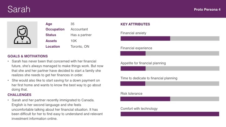
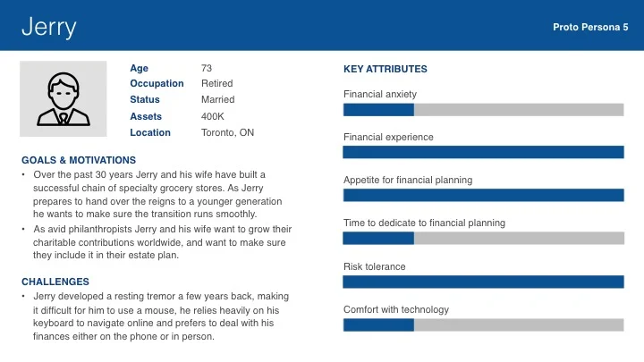
Based on market research proided by BMO, in addition to our stakeholder requirements gathering workshop, advisor and informal (family/friend) interviews I built out 6 proto personas, an even split between male and female, highlighting a range of ages and levels of financial security. These proto personas included the following information:
- Demographics (age, occupation, status, assets, location)
- Goals and objectives
- Challenges (including any disabilities)
In addition, based on the arc of wealth management service offerings, and the types of questions financial advisors might ask to guide their customers to an appropriate product, I ranked each persona based on the following key attributes:
- Financial anxiety
- Financial experience
- Appetite for financial planning
- Time to dedicate to financial planing
- Risk tolerance
- Comfort with technology
Customer Journey Maps
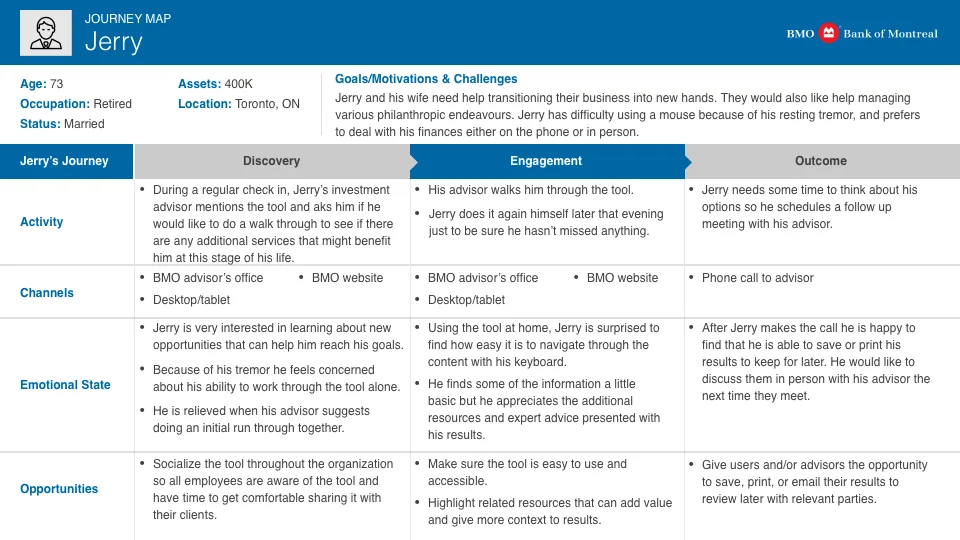
After presenting the personas to the stakeholder team we chose 4 of the 6 proto personas to focus on for the journey maps. The proto personas were chosen based on their diversity of characteristics, and loosely on who conformed closest to the market segment research. We also focused on the future, ideal state of the tool using insights gained from our research to inform opportunities presented for each journey.
When presenting these journeys to the BMO team we were very clear that the these journey maps are not conclusive and should be updated once the tool is live and can be tested with directly with users to validate them more definitively. We also recommended adding a section to the maps (as part of a potential phase 2) that would focus on how to maintain ongoing engagement with customers beyond their one interacation with the tool.
Outcome
All of our discovery activities culminated in a summary report and presentation to a larger stakeholder group where we highlighted key findings and provided a series of recommendations to lay the foundation for the design phase. Our presentation focused largely on the following high level recommendations:
- Make sure the tool is socialized throughout the organization.
- The tool should compliment other BMO tools already in use.
- We should aim to create a seamless experience beyond the tool.
- Explore opportunities to cross promote within other channels and with other campaigns.
Design Phase
Although I didn't take the lead on this stage of the project I continued to work with the lead designer to ensure all strategic outputs were implemented into the design, and worked closely with the content strategist to ensure that the content goals were taken into account throughout the design process.
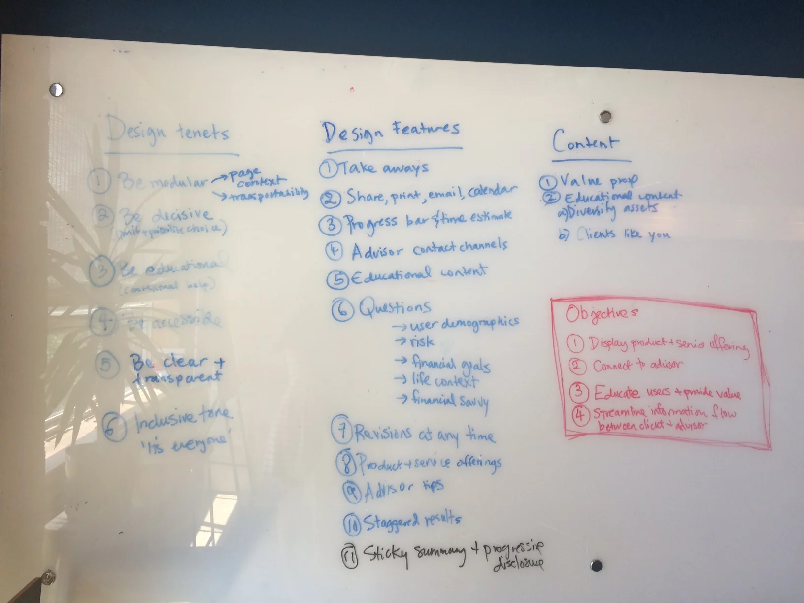
Design tenents, features and content based on startegic insights gained during the discovery phase of the project.
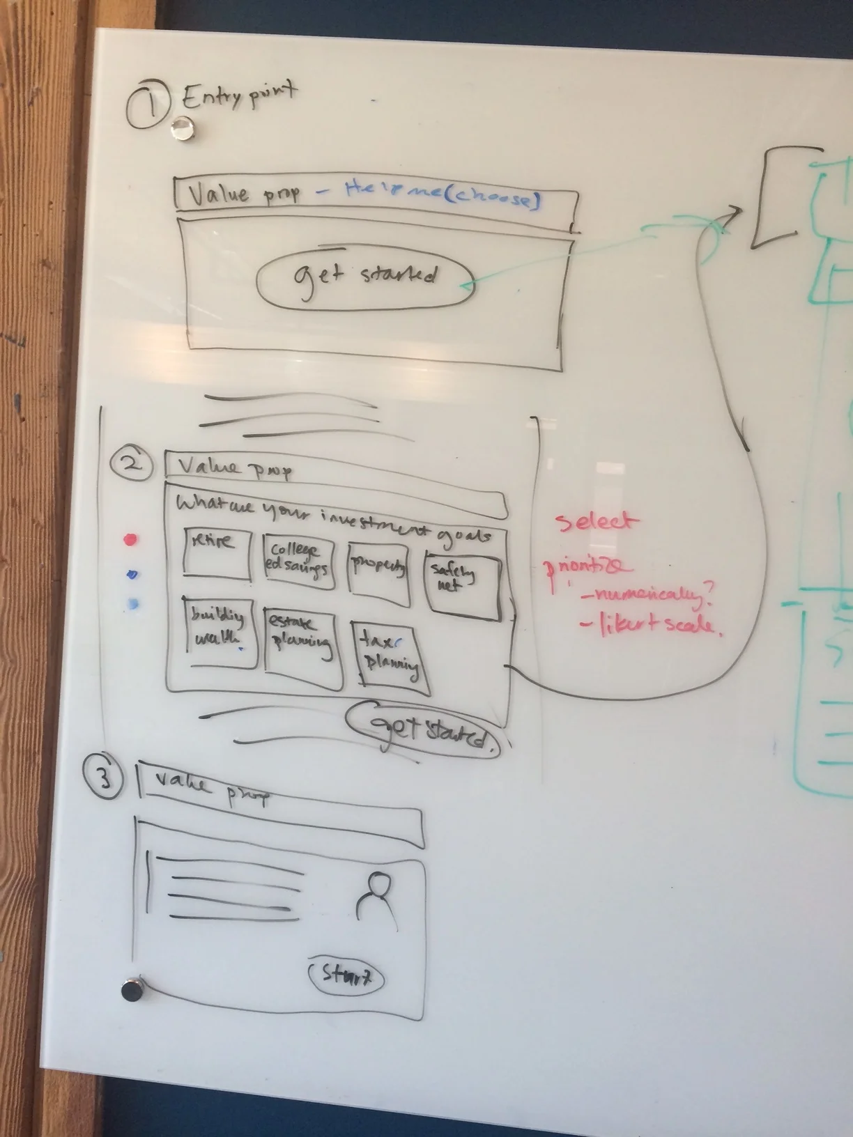
Initial sketches of the entry flow for the tool.
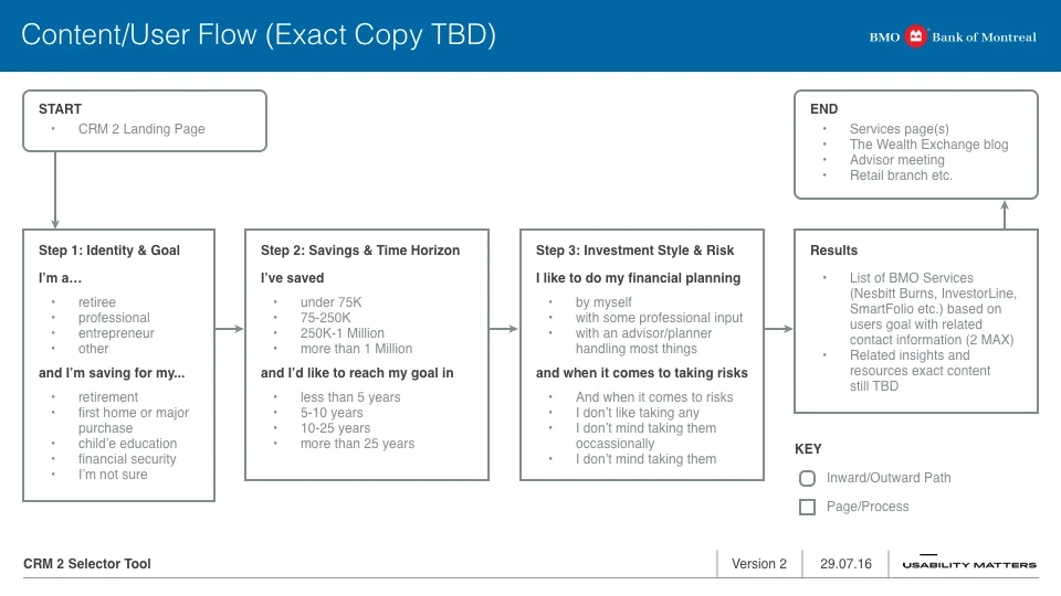
Proposed content flow for the tool, we wanted to focus on a limit amount of steps while providing relevant educational content at appropriate moments throughout the process.
User flow on mobile showing the final designs - brand requirements and time constraints ultimately limited the scope of our designs.
Lessons Learned
1. Keeping up with the Jones
When the client's team struggles to put users first the project outcome suffers. Ultimately it felt like the primary impetus for creating this tool had more to do with keeping up with the competition, than with providing a valuable new tool to their users. As a result the team struggled to keep users front and center and the end result reflected that.
2. No meaningful solutions without validated problems
Although the strategic groundwork was in place, without direct access to users and with no testing of the tool scoped, the end result was far from ideal. The final product was very safe and didn't meet our initial educational goal. It felt more like a funnel toward a product offering than a tool that would add real value to users lives and financial situations. If I had to do this all over again I would insist on conducting user interviews in addition to advisor interviews to validate more of the stakeholder assumptions and to give us more of an opportunity to validate user's needs.
3. Working in a vacuum
With limited time for discovery we were not able to take all of BMO's digital ecosystem (or even many of their related tools) into account such as the newly developed Needs Navigator tool - a well designed, step by step guide used to determine which financial products and services would be most relevant to wider audience. With any large institution it is easy to believe you are designing in a vacuum, but this is never the case, and taking the time to determine where a new tool should fit into this digital eco system, or whether it should be designed in the first place would have been good questions to explore even before we started our discovery process.
