BASF - Magazine Design
Context
BASF, The Chemical Company, offer their employees a lot of great perks. Perks like tuition reimbursement, cell phone discounts and flexible work arrangements. That's in addition to more traditional benefits like healthcare, 401K matching and dental insurance. The problem was that employees did not know about these benefits. So you@BASF was created to address this problem. Its goal was to introduce employees to the diverse range of resources available to them.
The cornerstone of the program is the you@BASF periodic table that graphically depicts the many benefits available to BASF employees. Icons represent specific offerings such as auto discounts, long term care insurance, and the BASF wine list etc. The icons are organized by theme, and broken down by colour: Benefits (Blue), Development (Green), Work Environment (Orange), and Compensation (Red).
YOU Magazine
YOU magazine was created to help introduce the you@BASF program. The magazine is published bi-annually, it ranges between 20 to 24 pages in length, and each new edition focuses on a different topic or theme. Initially published only for North American employees, as the you@BASF program expands globally, the magazine will follows suit.
Deliverables
- Naming of the magazine
- Masthead design
- Magazine design
Masthead Design
The magazine was one of the first places employees would see the periodic table so that was the starting point for the masthead design. Thus it was important to incorporate the 4 colour themes into the design in addition to keeping the clean and bold feel of the you@BASF brand intact.
While thinking about the direction for this design the word focus kept coming to mind. BASF needed to help employees focus on the resources available to them. you@BASF was focusing in on specific benefits, highlighting them in the periodic table. Employees could use those benefits to help them re-focus on life outside of work. So I started playing around with creating a masthead that mimics a viewfinder, where the focus is on YOU. Although we worked through many other iterations, this final version of the masthead design keeps YOU at the center surrounded by the multicolour viewfinder.
Magazine Design
I worked on all four issues of the magazine and was the lead designer for the the two most recent editions (shown below).
Issue 3 - Development Edition
This edition of the magazine focused on career growth and development. Brandy (the employee on the cover) had been a BASF employee for over 10 years and made great use of BASF's tuition reimbursement program. To connect back to the the periodic table I decided to include icon patterns using the development icons, and I incorporated arrows and coloured bands throughout the design as a way to reinforce the idea of upward mobility, progress and growth.
Current employees share their stories of career growth throughout their careers.
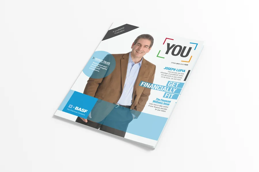
Issue 4 - Financial Wellness Edition
The Financial Wellness Edition was very content heavy (and to be totally honest a little dry at times) so I divided the content into smaller sections and developed a tabbed system to highlight these sections to help readers navigate through. Graphs and images were also used to break up the pages and to highlight important content.
Infogaphics, graphs, and images were used throughout the design to help bring the content to life.


