University of Toronto - REED Online, UX/UI
Context
The Records of Early English Drama (REED) is an international scholarly project located within the English department at the University of Toronto. For the past 35 years they have worked to locate, transcribe and edit historical records related to drama, music, and entertainment from the Middle Ages until 1642. This was the time of Shakespeare and his peers, and these records help provide additional context to that time period.
Over the years REED has published 27 collections in print but in an effort to ensure these important documents are accessible to all who seek them, they looked to move the collections online, to make them freely available for educational and research purposes.
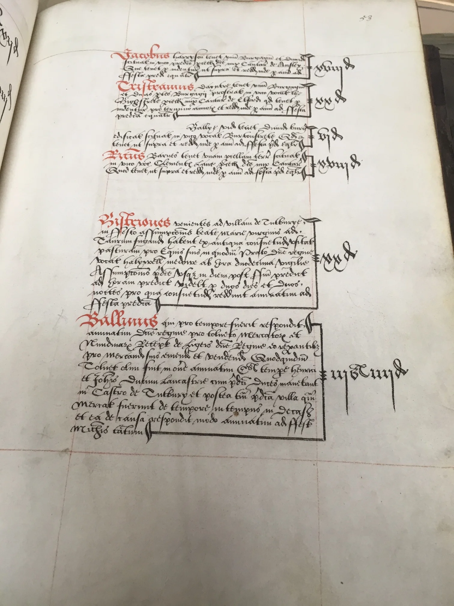
Original transcript, these documents are transcribed and edited into the REED collections based on geographic location.
This is the resulting transcript as it appears in a printed REED volume.
Challenge
1. Translate print to digital and don't mess with the structure.
This was the goal of the project, to translate the printed volumes into an entirely different medium, to optimize the content for a better digital experience while staying true to well established and entrenched editorial process. Academics who are familiar with the REED printed volumes have set expectations about the types of information they would find in a printed REED volume (index, end notes, marginalia, document descriptions etc.) and would no doubt expect to find all that information presented in a similar way online. So we knew one of our challenges would be to transition the material into a digital format, and optimize it where possible without altering the structure or the content too much.
2. Respect and cater to the needs of their audience, both current and future.
It was also important that we keep the REED reputation intact, the quality of the documentation and translation are well known in academic circles, we needed to make sure that we kept those standards just as high as we transitioned the collection online, to keep our established scholars happy. Additionally this project could be a great opportunity to reach a newer, broader, and potentially younger audience, to introduce them to the exciting new world of records research.
3. Keep an eye on the future, design a site that is both flexible and scalable over time.
Although we would be starting with only one collection online, the Staffordshire collection, moving forward all new collections would be published solely online, so the site would have to be flexible enough to house a large amount of additional content. Additionally, the REED digital ecosystem consists of many different sites (Patrons and Performances, Early Modern London Theaters, REED Northeast, Anglo-Latin Wordbook just to name a few). Right now these are all distinct websites, but the ultimate goal is for all the sites to eventually be housed in one place, to fall under a larger REED Online umbrella. In anticipation of this eventual expansion we paid special attention to how the site would scale over time, especially as we worked through the IA, the search page and the explore collections section of the site.
Process
We had 9 weeks before final hand off to the development team and during that time we focused on the following activities and deliverables, collaborating and co-creating with the REED team throughout.
Activities/Deliverables
- Discovery workshops (requirements gathering, target audience definition, competitive landscape, potential challenges)
- Content and feature prioritization
- Information Architecture
- Wireframes
- Prototype design and user testing
- Creative concepts
- Design mock ups
- Production support
Discovery Phase
We started this project with a one week discovery phase. We knew we wanted to gather as much information from the REED team as possible so we organized a series of collaborative workshops whose aim was to to gain a more defined understanding of user needs in addition to business and technical requirements. To do this we organized a series of activity based workshops, focused on the following:
- Proto personas - not nearly as robust, nor as preferable as conducting user interviews, but a quick way to foster internal alignment around audience definition (we felt comfortable doing this knowing that user testing would validate some of our assumptions later during the design process)
- Business requirements gathering - using the project model canvas as a base the goal was to get high level insight into design, content, project goals, potential challenges, and the competitive landscape. This was a great opportunity to get the team aligned and talking about the project from multiple perspectives. Although this approach often leads to more questions than answers, it was a great jumping off point for future discussions as we moved into the design phase.
- Love letter from the future - a great way to discuss successful outcomes, highlight blue skies thinking, understand each team members strengths and get a sense for any challenges that may arise as the project developed.
Proto personas completed by the REED team to help foster internal alignment around a primary and secondary audience for the site.
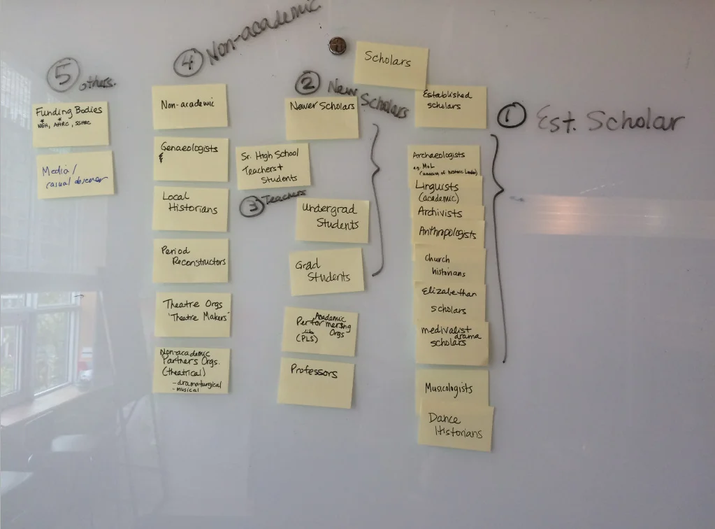
Multiple audiences were suggested throughout the workshop, we recorded each suggestion and ranked them based on the team's existing knowledge about who uses the collection most freuently.
Audience*
From the proto persona workshop we were able to identify two key user groups:
- Alan: the "established scholar", has a PhD and is very familiar with the REED volumes. He is excited to be able to search the records online and wants easy access to the “core record data”. He is not interested in anything too flashy and is looking for assurance that REED's high standards are not compromised online.
- Bryan: the "young grad", is new to primary research and needs a bit more of an introduction to the REED collection. He would appreciate any supportive content to help him understand the research process, and is more likely to browse through the collections in addition to searching for specific records.
* Based solely on stakeholder feedback, these proto personas were in no way meant to replace formal user research. They were intended as a guide for internal alignment purposes only, with the expectation that they would be validated during user testing.
Outcome
As we wrapped up the discovery phase we reached a few conclusions that would help inform the design phase of the project:
- We confirmed our suspicion that the search and record view page would be the most functionally heavy and would require the most attention.
- We gained alignment around the target audiences for the site.
- We understood the limitations around some the nuanced content of the printed REED volumes so had a better grasp on how to move forward with the site IA and where some expected features and functionality might live.
Design Phase
The beginning of the design phase marked a shift from learning to doing. Now that we had set the scene we were ready to roll up our sleeves and get to work. We started the design phase by defining the site's structure, paying special attention to how our two audiences might perceive the site based on their dual motivations of searching the records vs. finding out more about the research process.
Information Architecture
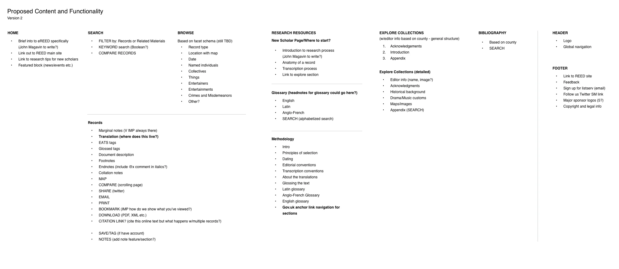
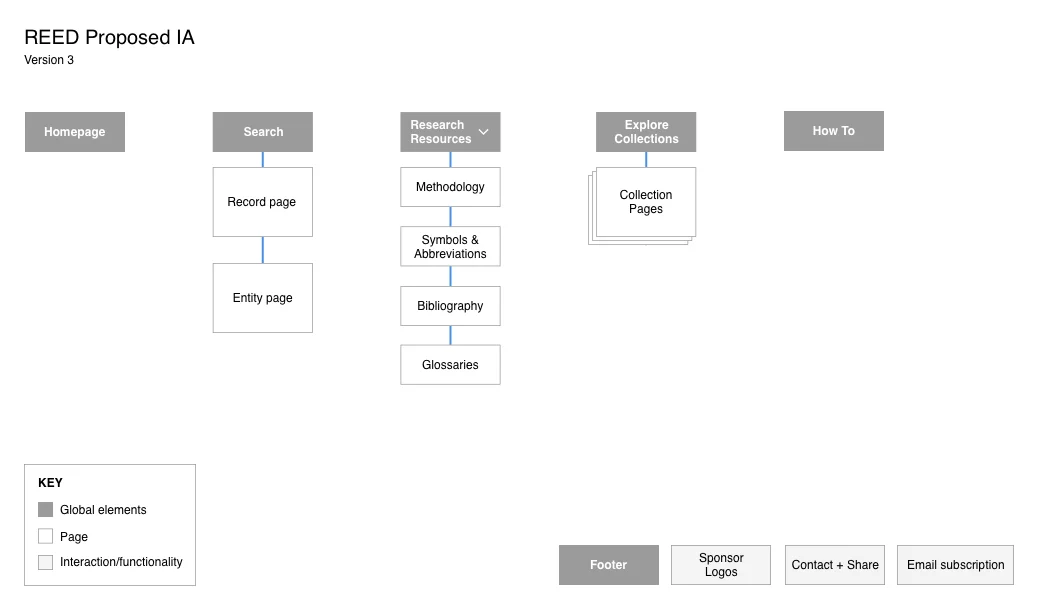
Using the books as my guide I mapped out the site's content (along with some of the features and functionality that had surfaced during the discovery phase) and started to structure that content into the IA for the site.
Breakdown of proposed site content by page and site's architecture
Search
From the start of the project we knew that the design of the search page was going to be crucial to the success of the site. Searching for records would be our user's primary motivation for accessing the site so we needed to make the search as simple as possible, but also robust enough to handle the inherent complexity of the record tagging system.
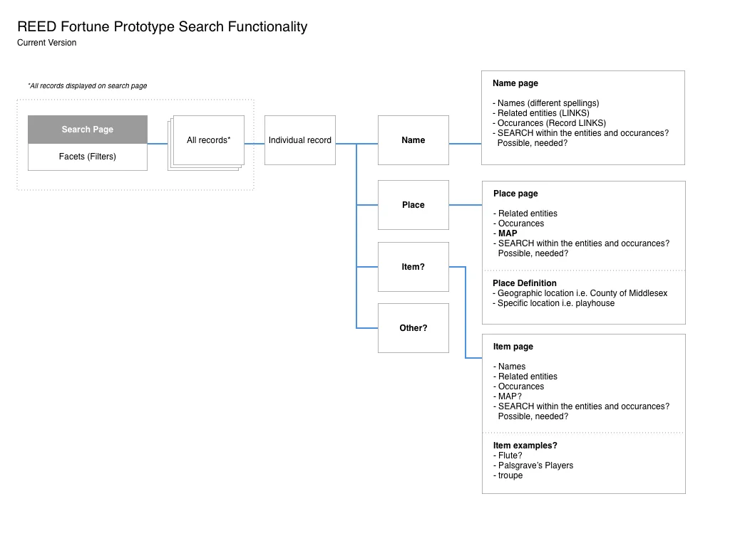
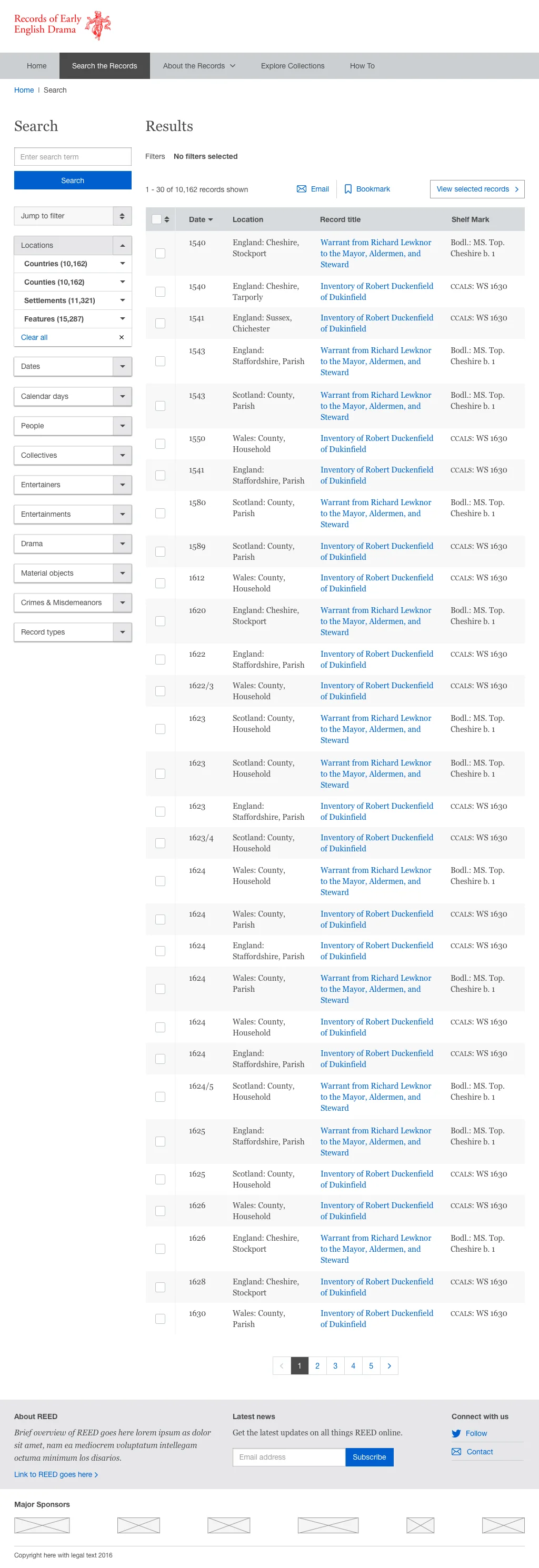
Together with the site's back end developer (who had previous experience building similar systems for other REED projects) we worked through multiple variations of the search page before landing on a multifaceted filtered search option that could accommodate both the technical limitations of the prototype, but still provide a robust search interface to our established scholars who would relish the opportunity to conduct their search using multiple criteria (something that was not possible offline).
Proposed search flows with additional functionality questions, part of an iterative process to determine the best search approach for the site.
Search Filters
The REED Online search was based on a series of filters defined by tags found within each record. The tags (or facets as the REED team liked to call them) were constantly evolving and being reorganized based on themes found throughout all the collections. The search filters would ultimately take the place of the book indices, so the needed to be named and organized appropriately. As the REED team built out this taxonomy of facets, we collaborated closely with them focusing on usability to ensure appropriate naming conventions and hierarchical structure was used.
A section of the search facet schema (filters) that would form the multifaceted search on the site.
Wireframes
The next step was to bring all this information together in a series of templated wireframes that could be used for user testing. Before jumping directly onto a computer I sketched out various options for the templates and sought feedback from other designers at UM who were not involved directly in the project to get their sense of what was and wasn't working. I knew that being so close to a project for such a long time could make me blind to some of the more nuanced details, by sharing my work I hoped to gain some new perspective before completing the wires for the testing prototype. I also hoped that by working out some of the smaller kinks early on, we would be in a better position to discuss the templates with the client before we moved into testing.
For the testing itself, I opted for higher fidelity wireframes given the complexity of the search and records pages (which would be the focus of the testing) and I used InVision to produce the prototype.
Record view page sketches, side by side comparison versus single view with widgets.
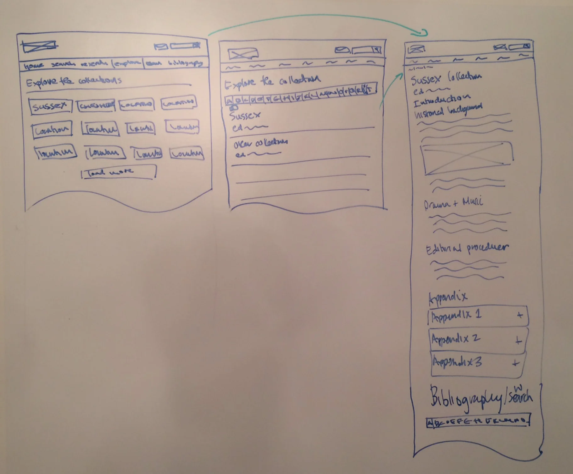
Exploratory sketches of the Explore Collections section of the site.
User Testing
With our client approved test plan, facilitator script and prototype in hand we were ready to start our user testing. Our goal was to evaluate the overall usability of site, paying special attention to the navigation, search page, and individual records page.
We used the following participant criteria and testing methodology:
- 8 participants
- Established scholars, new graduates and one high school history teacher
- In person one hour moderated sessions
- All testing done on the desktop version of the site
- Task based activities using a think out loud protocol
Outcome
Overall the site tested very positively. Our participants were very excited and grateful to have the opportunity to explore the collection online and could see the potential for exciting new avenues of research that would not be possible to explore using the printed volumes alone.
That said, we did discover some issues around the labeling of certain navigation items and search filters. In addition to some issues with the tool tip displays for the marginalia and footnotes. We did not encounter any huge red flags to the overall usability of the site and were very encouraged by the positive feedback we received from our testing participants.
We encouraged the REED team to come and view the testing sessions and once completed, we reviewed the results together and implemented the necessary changes before moving into the final design stage of the project.
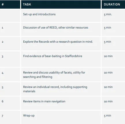
Task list outline for user testing - we intended to spend more time focusing on the search and individual records pages.
Visual Design
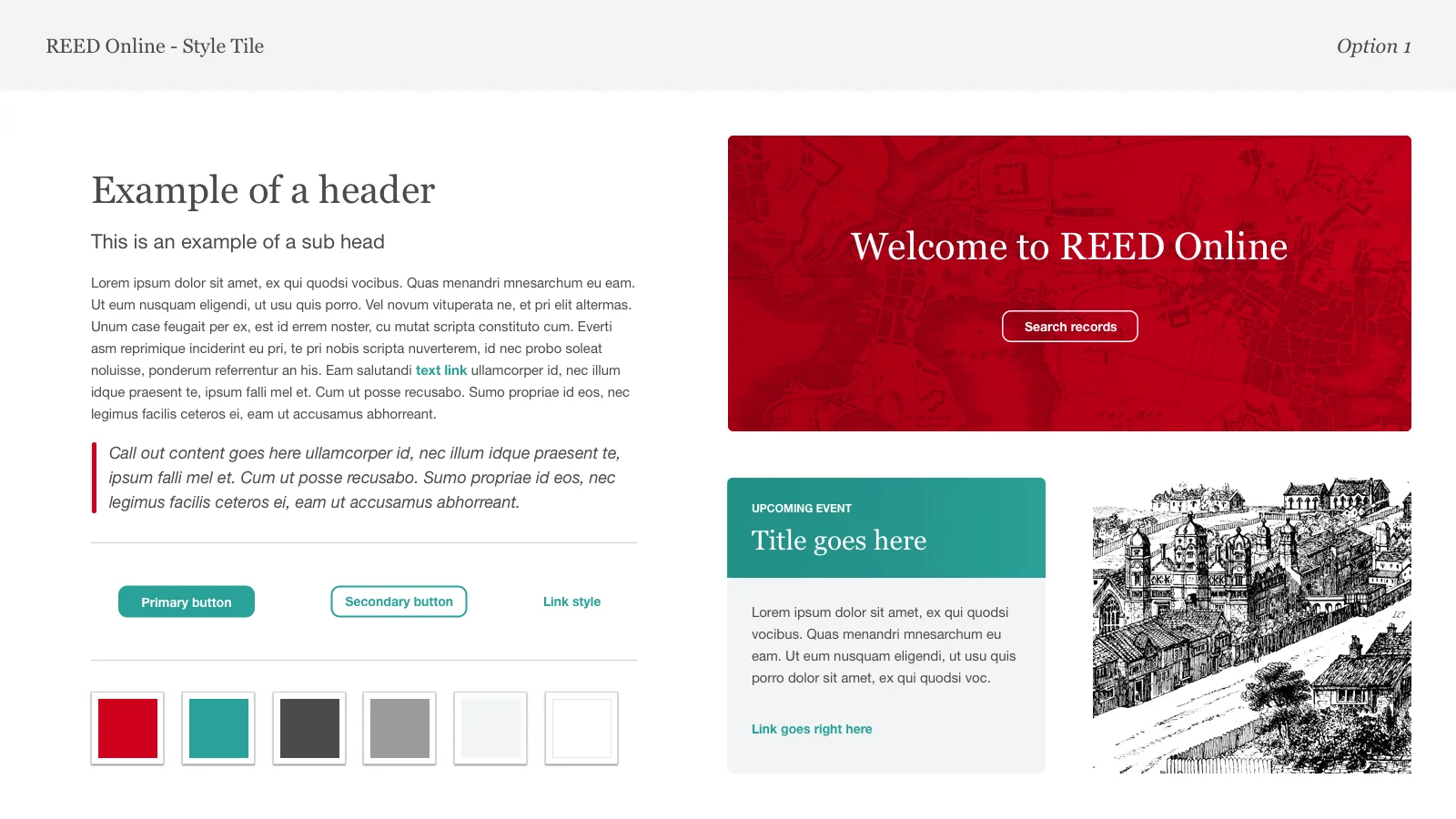
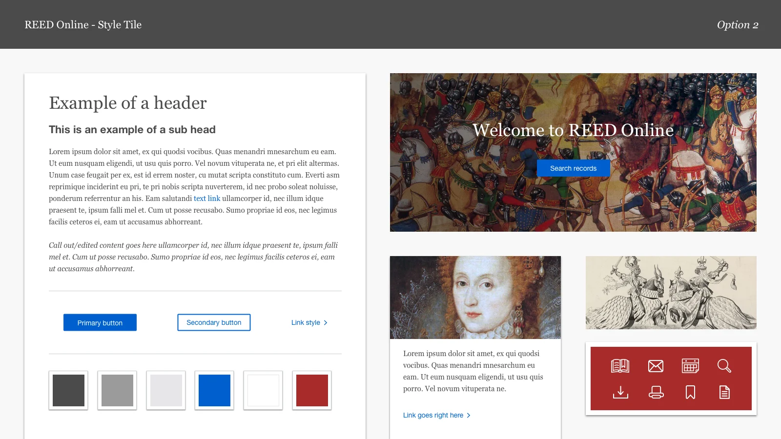
Next we shifted our attention toward look and feel. I built a visual design survey to send to the REED team and used the results to host a design workshop where I presented some initial creative concepts in the form of style tiles.
Some general takeaways from the survey and design workshop include:
- Aim for AA accessibility
- Colour and font style can be leveraged from the books
- Preference for a competent and sophisticated tone (based on the "What if the site were a person?" survey question)
- Preference for a clean/minimalist look with some decoration/personality
“A few images would be nice but not too many and not too large.”
“Performance is a very concrete, messy, embodied activity.”
Creative Concepts
During the design workshop I presented two creative concepts to the REED team. Option 1 was a little more modern in terms of colour and illustration, option 2 was a little more traditional but not vastly different from the first option, because by this point we had a solid understanding of the current REED brand and a good grasp on the client's preferences, especially around the balance they wanted between professionalism and fun.
Final Mockups
Overall the design phase of this project felt fairly rushed but there was still enough opportunity to refine the colour palette, fonts, buttons, link styles and all the other interface elements (including subtle animations and interactions) that make a site look polished and professional. We ran into a few difficulties getting access to the rights for certain imagery (I know more about licensing requirements at the Bodleian library at Oxford University that I thought I would ever know) but once we have secured the rights to a few of our favourite images we were good to go.
The ultimate visual design direction was a mix of both creative concepts (the usual Frankenstein design which all us visual designers love) and embraced a (mostly) flat design aesthetic, with a simple colour scheme, limited imagery, iconography and a combination of serif and sans serif fonts to balance professionalism and history with a little something new. Overall we hoped to create a professional, yet not too subdued, clean and modern design that could grow and evolve with the content and REED brand over time.
Woodcut image of a bearbaiting from William Lily's Antibossicon, 1521/Folger Shakespeare Library, Digital Image Collection.
Lessons Learned
1. You don't know what you don't know. The importance of forming strong partnerships with subject matter experts.
I knew close to nothing about early english drama and record translation when we started this project so I relied heavily on our client and other subject matter experts to fill in my gaps of knowledge. These experts were my best allies and helped me produce a more robust and valuable site for our users. Ultimately I learned to embrace the unknown and to ask as many questions as possible as early on as possible.
2. Balancing usability with feasibility isn’t always possible.
A lesson learned through multiple iterations of the search functionality, we made compromises along the way and were able to test them to ensure that usability wasn't compromised too much. But some compromises needed to be made in order to keep the project moving and to deliver the final product on time.
3. Learn the team politics and communicate, communicate, communicate!
Working with a developer based in New Zealand brought with it it's own unique challenges. To keep the project on track we had to keep in constant contact using all channels available to us. In addition our developer had a prior relationship with the REED team which meant that our team was coming in as a third party and had to learn how to navigate this established relationships in order to move our own agenda forward.
